Problem
The PMAY website was in need of a refresh, and the client sought to develop a visual language that would more accurately convey the values of the music education nonprofit. Currently, the website is built from a basic template and lacks a clear sense of hierarchy or consistent visual language, making it difficult for users to navigate the site. Some major pain points include the repetition of content across multiple pages and the use of a large amount of tabs in two separate navigation bars.
Wireframes
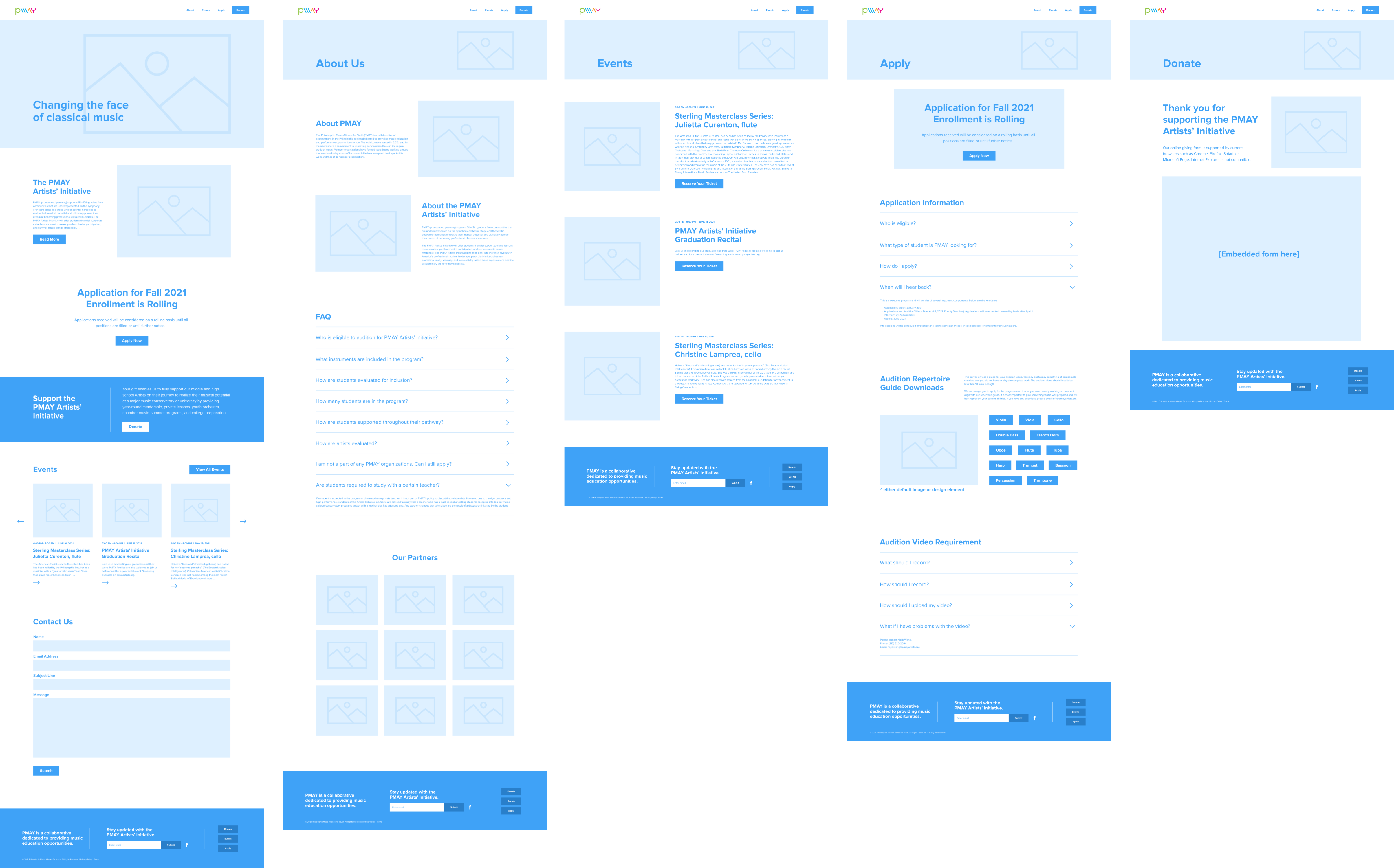
The wireframe focuses on addressing the functional issues with the current site. It aims to simplify the navigation and cut down on any unnecessary content. The client indicated that they wanted to prioritize the about, events, application, and donation pages; all other content was free to be cut. As such, let us define the users.
- User 1 (The Applicant): The applicant is a user of the nonprofit’s target demographic (K-12 low-income students) who already knows basic information about the program and is looking to apply. This user wants a streamlined application process where the requirements are made visually clear and easy to navigate.
- User 2 (The Prospective Parent): The prospective parent is the guardian of a possible applicant who is looking for a suitable music program for their child. They are searching for basic information on the program and are aiming to get a general sense of the program’s values, environment, and level of prestige.
- User 3 (The Enrolled Parent): The enrolled parent is the guardian of a student currently enrolled in the PMAY initiative. This user only checks the website to view information on events their child may be involved in and to donate to the program.
With these users in mind, we can assert that the pages to be prioritized are the about, events, application, and donation pages. Paring down the content to these categories and only displaying said categories on the navigation bar will serve to greatly simplify the user’s journey. Each category will also receive its own respective module on the homepage in the order of about > apply > donate > events. This system linearly walks a new user through the information of the program in order of priority: an introduction to the program > call to action for applications (and application information) > call to action for donation > events (which a new user may be less likely to look at if they are not already enrolled in the program). Old users will still be able to access any page immediately through the simple navigation bar.
Visual Brief
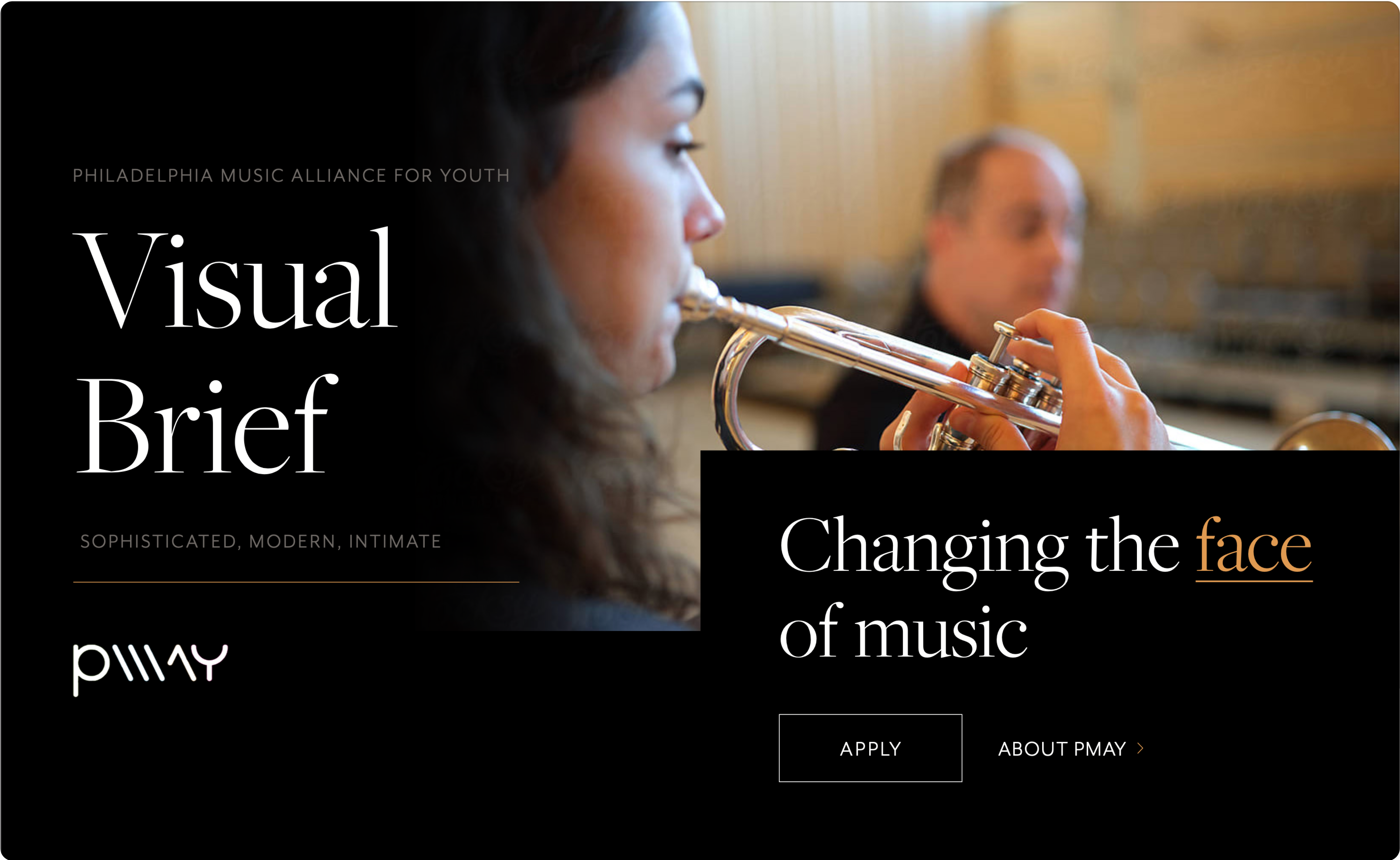
The visual brief presents two possible directions for the client to choose from. Overall, it focuses on establishing a clear visual language to resolve the inconsistencies of the current website.
Option 1 (sophisticated, modern, intimate)- Goal: To highlight student performance in a sophisticated manner.
- Execution: This option focuses on bold moments of serif type to develop a language of sophistication. The color palette reinforces this language through the use of black (with various pops of color). This dark color palette allows the site to immersively showcase the photography and videography of the students’ performances.
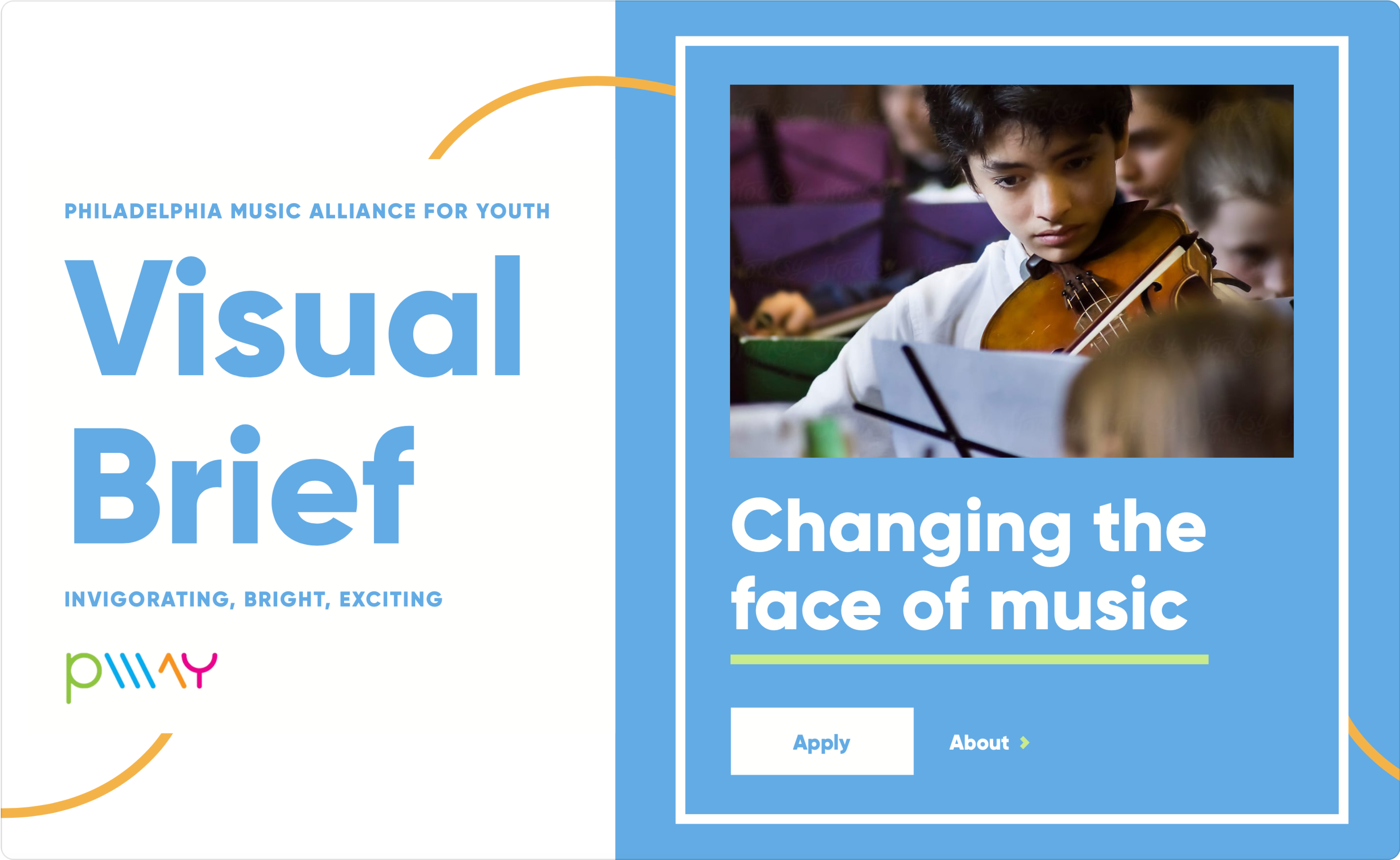
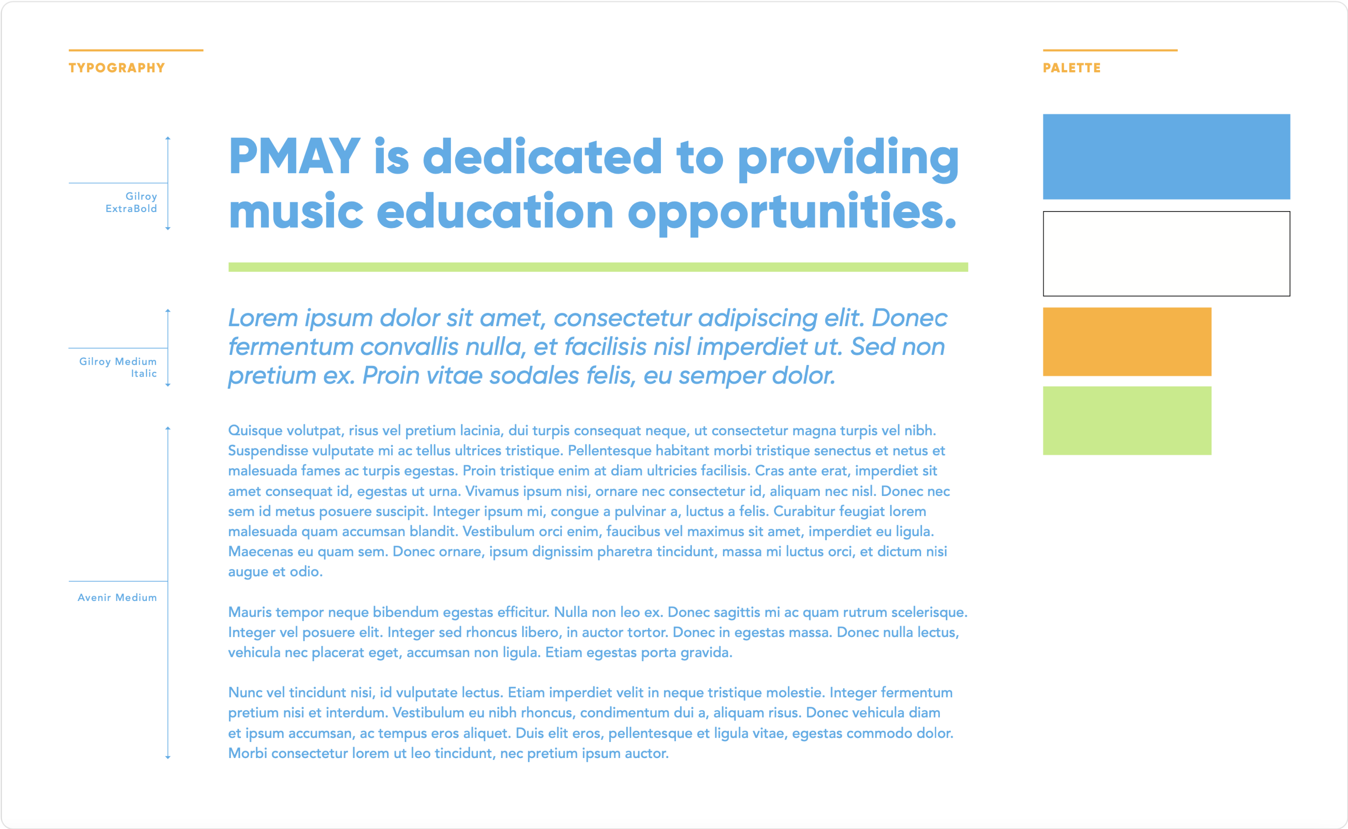
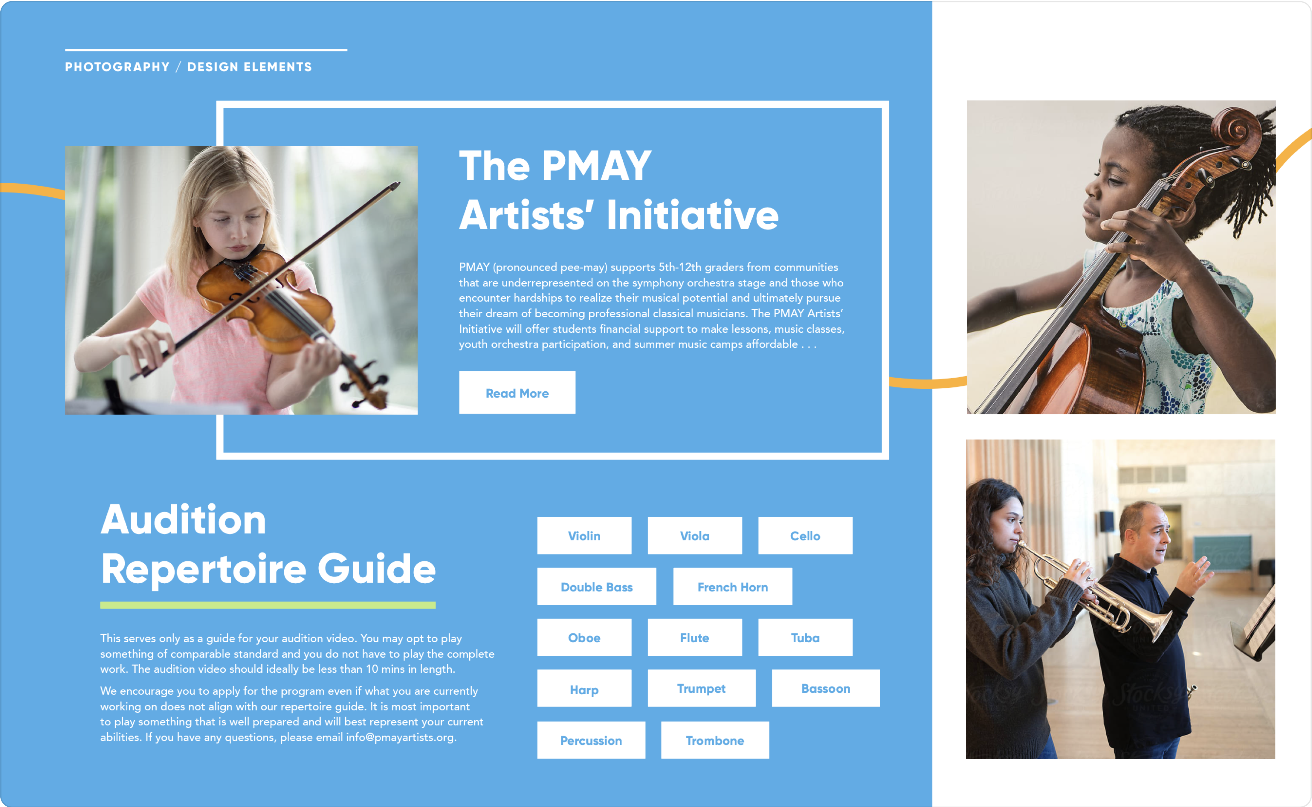
 Option 2 (invigorating, bright, exciting)
- Goal: To create a site that captures the fun and liveliness of music.
- Execution: This option incorporates a bright color palette that accentuates the lively nature of music. This color palette is paired with a bold sans-serif typeface, which grounds the bright colors while maintaining a playful tone. The wavy graphic element breaks up the blockiness of the composition and serves as an emulation of the flow and phrasing of music.
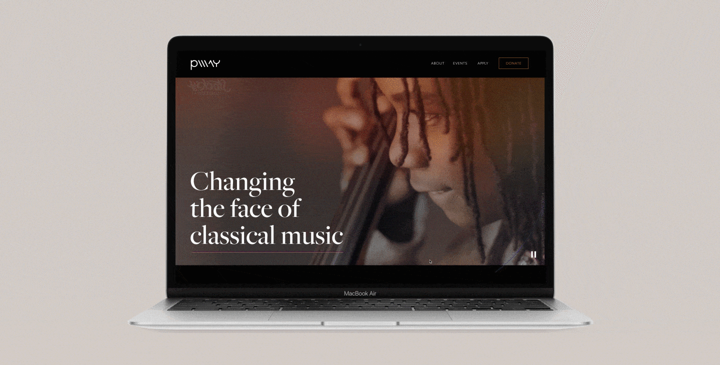
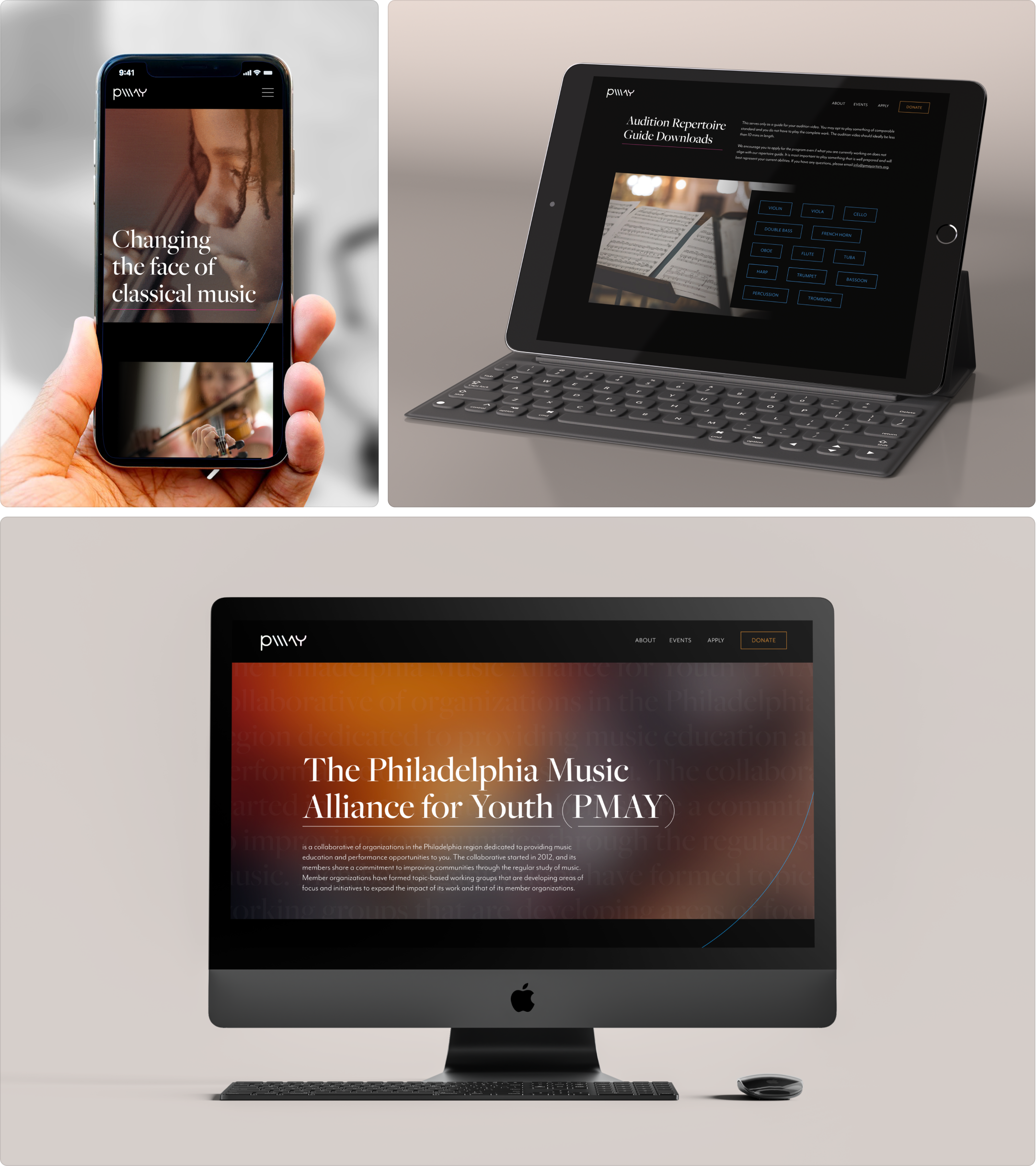
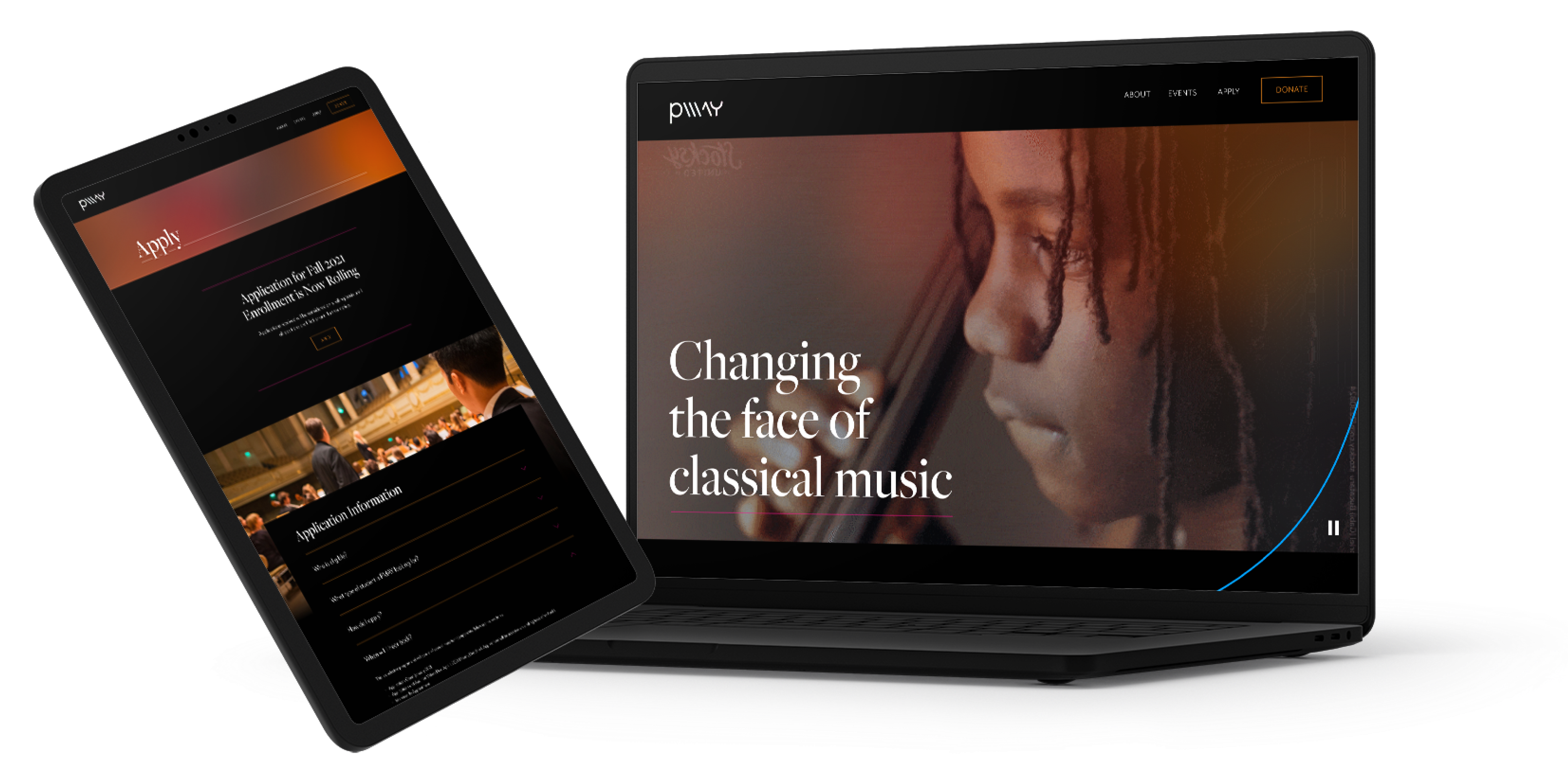
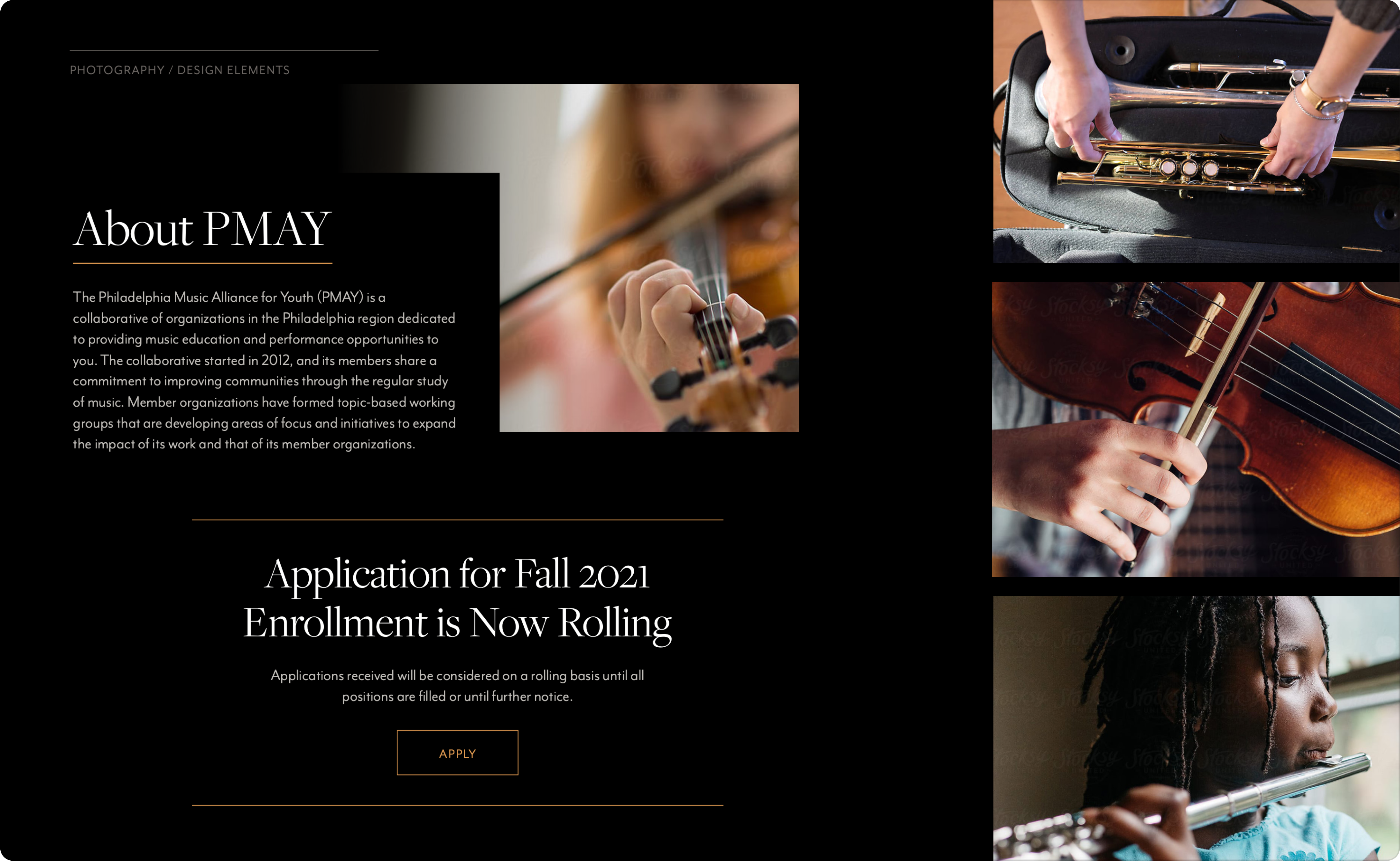
Proposed Website
Given that the client selected the first visual brief option, the resulting proposal combines the structural changes detailed in the wireframe and the identity that the visual brief developed. Refinements to the visual language were made during the development of the final proposal. One such refinement includes the incorporation of gradients in the banners of each page, which adds depth to the color scheme and represents a visual abstraction of hearing music. Another refinement is the use of the wavy line from Option 2 of the visual brief; this graphic element provides yet another visual representation of music.
View the Prototype ↗